


Whey Protein Label Design: Building Powerful Brands Through Packaging
In India’s booming fitness and health industry, whey protein has become a staple for athletes, gym-goers, and wellness enthusiasts. But as the supplement market gets more competitive, one factor determines whether your product grabs attention — your label design.
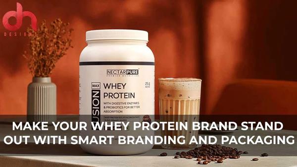
A powerful whey protein label design is more than a visual wrap — it’s your product’s first impression, silent salesperson, and brand ambassador. It’s what makes customers reach for your jar among hundreds on a store shelf or scroll-stopping ads online.
In 2025, design isn’t just decoration; it’s strategy. Especially in a market where fitness brands are growing exponentially, your label must tell your story of strength, purity, and trust in a single glance.
The Role of Label Design in the Fitness Supplement Industry
When it comes to protein powders, the competition is fierce — from global names to emerging Indian brands. What differentiates a successful brand is not only the formulation inside but the visual credibility outside.
Here’s why your whey protein label design matters more than ever:
1. First Impressions Drive Trust
Consumers judge the product’s quality based on its appearance. A professionally designed label immediately conveys authenticity and reliability — crucial for health products.
2. Communicates Brand Positioning
Your design speaks volumes about who you are. Are you a hardcore bodybuilding brand, a premium lifestyle product, or a clean, natural supplement line? The label should reflect that identity instantly.
3. Delivers Essential Information Clearly
From protein content to ingredients, flavor, and usage instructions — the design must present data in an organized, legible way without feeling cluttered.
4. Meets Compliance Standards
Nutritional supplements in India are regulated by FSSAI and global markets by FDA standards. A well-designed label balances creativity with regulatory accuracy.
When form and function meet, your label transforms from packaging into performance marketing.
Design Elements That Define Great Whey Protein Labels
A standout whey protein label combines bold visuals, precise details, and emotional appeal. Here’s what makes it work:
1. Color Psychology
Colors evoke emotion and differentiate product types. Black and metallic tones convey strength and power, while white and blue imply purity and trust. Fitness-focused brands often combine dark backdrops with vibrant accents for energy.
2. Typography
Fonts reflect the brand voice. Bold sans-serifs suggest confidence and masculinity, while sleek modern typefaces appeal to a lifestyle audience. Readability is non-negotiable, especially for nutritional data.
3. Imagery and Graphics
Dynamic textures, gradients, and performance cues like muscle silhouettes or energetic shapes make labels pop. For clean brands, minimal designs with realistic imagery work best.
4. Material and Finish
Matte laminates, spot UV highlights, metallic foils, and holographic effects add a tactile dimension — giving premium products a distinct shelf presence.
5. Consistency Across SKUs
Your design should be scalable. From whey isolate to mass gainer or pre-workout, the label system must feel like part of one family while retaining unique visual cues.
A professional packaging design agency in India, like DN Designs, ensures these elements come together seamlessly — blending creativity, precision, and strategy.
Brand Identity Through Label Design
Your label is the visual voice of your brand. It should tell a story that connects with your audience’s aspirations.
For example:
- A gym-focused brand might use intense colors, bold typography, and high-contrast visuals to appeal to athletes.
- A lifestyle wellness brand may prefer minimalist layouts, clean fonts, and soft tones to target everyday fitness enthusiasts.
DN Designs, a top branding agency in Noida, specializes in decoding brand DNA before designing. They craft labels that not only look appealing but also communicate your philosophy — whether it’s strength, purity, or performance.
The Psychology of Trust in Whey Protein Label Design
Supplements go inside the body — which means consumers are cautious. Trust plays a massive role in buying decisions.
Here’s how design can influence trust:
- Transparency: Showing ingredient clarity and nutritional details prominently.
- Certifications: Displaying FSSAI, ISO, or GMP badges clearly to ensure credibility.
- Visual Honesty: Using realistic graphics instead of exaggerated results.
- Consistency: Uniform branding across product lines builds familiarity and reliability.
A label that feels authentic and professional reassures the customer that the product inside is safe, effective, and worth their investment.
Trends Shaping Whey Protein Label Design in 2025
The supplement market is fast-evolving — and design trends are keeping up. Here’s what’s defining the look of modern protein labels:
1. Bold Minimalism
Simplicity sells. Clean designs with high-contrast typography and minimal clutter feel premium and modern.
2. Metallic and Neon Accents
Bright accents — neon orange, electric blue, or chrome gradients — create energy and athletic appeal.
3. Eco-Friendly Packaging
Sustainable tubs, recyclable labels, and paper-based pouches are becoming popular among conscious brands.
4. Smart Labeling
QR codes linking to product origins, certifications, or video content create transparency and engagement.
5. Lifestyle Storytelling
Brands are increasingly using imagery that reflects real users — athletes, yogis, or fitness enthusiasts — making the design relatable.
DN Designs: Crafting Impactful Protein Label Designs
In the crowded supplement industry, DN Designs stands as a creative powerhouse. As one of the leading branding and packaging design agencies in India, they understand that every gram of design detail contributes to brand growth.
Their team combines brand strategy, visual communication, and technical packaging knowledge to create labels that not only attract but convert.
From designing for emerging D2C fitness brands to established supplement companies, DN Designs ensures every label balances style, compliance, and shelf impact.
Whether it’s designing labels for whey protein isolate, plant protein, or pre-workout supplements, their designs speak the language of energy, credibility, and aspiration.
The Business Impact of a Great Label
A powerful label can turn an unknown supplement brand into a trusted name.
Here’s how impactful design drives results:
- Increased Sales: Eye-catching labels attract buyers instantly.
- Brand Recognition: Consistent design builds identity and recall.
- Premium Positioning: Great design makes your brand look worth the price.
- Customer Loyalty: Professional packaging reinforces trust and repeat purchase.
In short, good design doesn’t just decorate your product — it drives your business.
How to Choose the Right Design Agency for Your Supplement Brand
Your label is too important to leave to chance. Choose a design partner who understands both aesthetics and compliance.
When selecting a whey protein label design agency, consider:
- Experience in the supplement industry.
- Understanding of FSSAI/FDA label requirements.
- Strategic thinking — not just creativity.
- Ability to handle multiple SKUs and packaging formats.
- Portfolio showcasing balance between fitness appeal and brand storytelling.
DN Designs ticks all these boxes — helping brands design for both muscle and meaning.
Conclusion: Designing Strength, Building Trust
In the world of fitness and nutrition, packaging is as powerful as the product itself. Your whey protein label design isn’t just a visual layer — it’s your first handshake with the customer, your silent salesperson, and your credibility on display.
A great label conveys energy, discipline, and trust. It tells your audience that your product delivers on its promises. And when that story is told with precision and creativity, your brand doesn’t just compete — it dominates.
Partnering with a professional packaging design agency like DN Designs
esigns ensures your labels capture attention, communicate value, and connect emotionally. They understand that design isn’t about trends — it’s about timeless trust built through clarity, creativity, and consistency.
Because at the end of the day, your protein might build muscles — but your label design builds your brand.