CHARTS IN EXCEL
We make charts in excel to represent data graphically and to increase understandability of data.
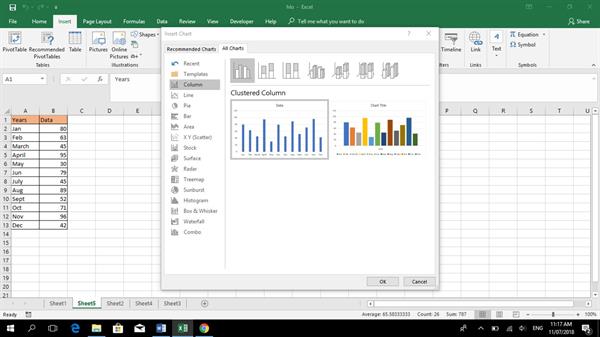
Go to insert Tab->Charts->Recommended Chats
There are variety of inbuild charts, some of them are-
- Column
- Bar chart
- Line chart
- Area chart
- Pie chart
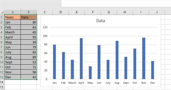
- Column chart
It represents vertical bars, contains two axis X-axis and Y-axis.
For example, we have two columns one is Years & other is Data. To make a chart
STEP 1: Select the data to form a chart
STEP 2: Go to charts->Recommended Charts->All charts->select column chart
|
Years |
Data |
|
Jan |
80 |
|
Feb |
63 |
|
March |
45 |
|
April |
95 |
|
May |
30 |
|
Jun |
79 |
|
July |
45 |
|
Aug |
89 |
|
Sept |
52 |
|
Oct |
71 |
|
Nov |
96 |
|
Dec |
42 |
- It will look, something like this.
OUTPUT
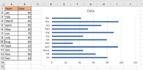
- Bar Chart
It represents horizontal bars.
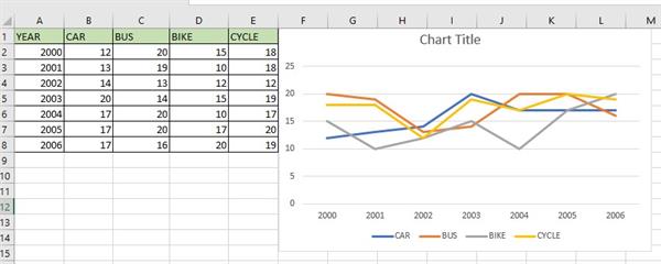
- Line Chart
It is mainly used to represent Trends, when we want to compare trends in a company.
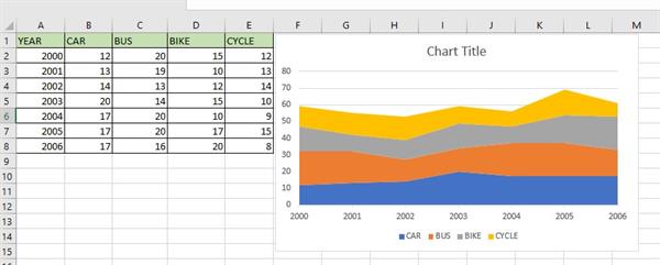
- Area Chart (Stacked)
It is similar to line chart only difference being it will cover the area.
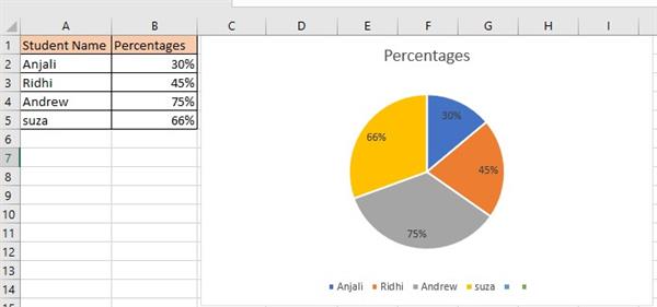
- Pie Chart:
It is used to represent percentages.